Recently Admiral added support for Dell switch backups in WatchTower, which faced unexpected difficulties. This,…
Inclusive Development: Tips for Building Colorblind-Friendly Software
At the start of 2023, the RemoteWinBox team set a goal to polish and perfect the dashboard with improved user interface. We released new color themes that helped users choose light or dark color options, but some of our own engineers and developers have color sensitivities and mentioned that it was still a struggle to infer router status based on the color of an icon alone.
As a result, the product and development team was tasked with improving the design and color scheme of our dashboard for people with eyes sensitive to light, color blindness, or just color preferences.
The team started exploring strategies for improving dashboard accessibility and customization. We found that it’s not as simple as swapping out certain colors to ensure a comfortable and efficient user experience for everyone.
Understanding the User’s Needs:
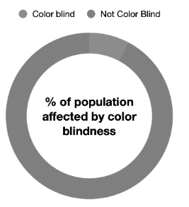
Before diving into design solutions, it’s crucial to understand the diverse needs of users. Light sensitivity, for instance, can make bright screens and harsh contrasts uncomfortable or even painful. Color blindness affects how individuals perceive color, necessitating clear distinctions beyond hues. Personal color preferences, while not a physical need, are equally important for a positive user experience.
Customizable Color Themes:
Allowing users to select from various color themes or create their own can significantly improve the user experience. This customization not only benefits those with color blindness but also caters to personal preferences, enhancing overall satisfaction. In our dashboard we have a light color theme and a couple of dark color themes available.
Color Blind Friendly Palettes:
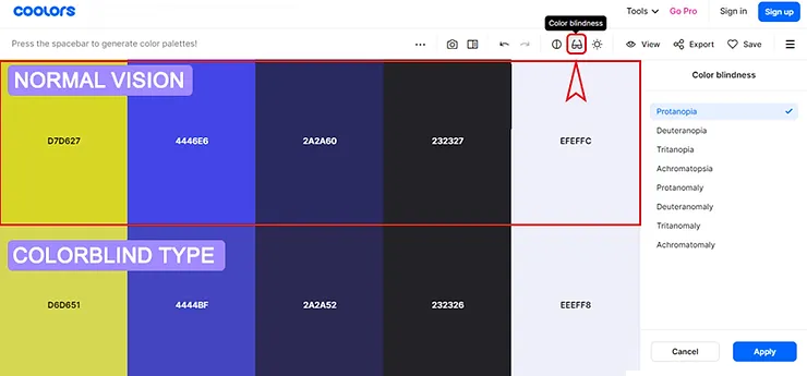
Designing with color blindness in mind means avoiding color combinations that are difficult to differentiate for those with color vision deficiencies. Utilizing patterns, textures, and labels alongside colors can make information more accessible. Below is a mock-up for an idea of adding patterns to our graphs.
A quick Google search can give designers tools for finding accessible color palettes and measuring color contrast like this one from Coolors.co
Use of Clear, Legible Fonts:
Text clarity is paramount. Using fonts that are easily read and of sufficient size can make a significant difference, especially for users with visual impairments. Offering the ability to adjust font size further enhances accessibility.
Minimalistic Design Approach:
A cluttered interface can be overwhelming. Opting for a minimalistic design with ample white space can help reduce visual stress and make navigation more intuitive.
Testing and Feedback:
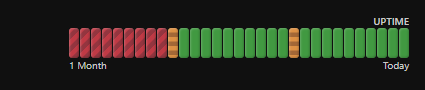
User testing, particularly with individuals who have light sensitivity or color blindness, is invaluable. Feedback from real users can guide improvements and ensure the dashboard meets the needs of its diverse user base. In the example below, our developer swapped out the red offline icon with an empty red circle to make it easier to differentiate from the online icon and used a donut shape to indicate routers with permission issues.
Accessibility Guidelines Compliance:
Adhering to established web accessibility guidelines, such as the Web Content Accessibility Guidelines (WCAG), ensures that your dashboard is user-friendly and compliant with accessibility standards. As a team, we continue to make improvements in our dashboard and are working on a color theme that would be specific to users with color blindness.
This process helped us to learn that by implementing thoughtful strategies we can create better dashboards for those with light sensitivity, or color blindness, and provide a seamless and more comfortable experience for all users.
We encourage software developers, designers, and product managers to consider these tips in their work. Your efforts in making digital spaces more accessible can have a profound impact on the user experience.
Related Posts